What a menu board is for
Someone in a queue has a few moments to decide. They want to find what they came for, check the price and, if something catches their eye, try it. A good menu board makes all three easy. A crowded one makes people fall back on what they always order, or hold up the queue while they read.
So design for the decision, not for completeness. The full menu can live on a printed card, a QR code or your website. The board's job is to help the person in front of it choose quickly, and to put the items you most want to sell where they'll be seen.
Split the menu across screens with a purpose
If you have two or three screens above the counter, give each a clear job instead of spreading one long list across all of them. A layout that works in many cafés:
- One screen for what people come in for: the core drinks or dishes, grouped and priced.
- One screen for the rest of the menu: food, extras, sizes and add-ons.
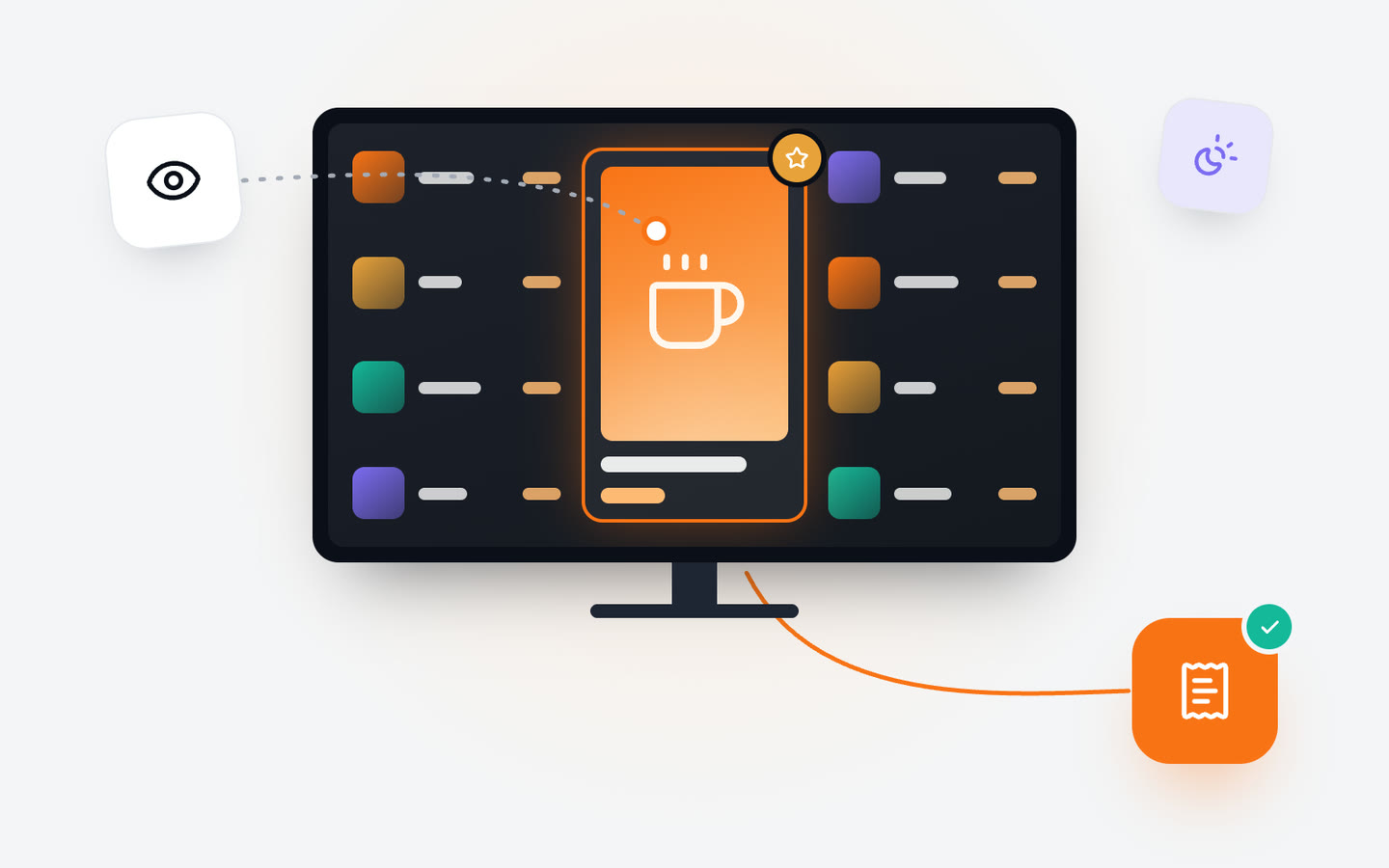
- One screen for what you want to sell more of: a seasonal item, a combo, a dessert. This one can change through the day and show photos or short video.
With a single screen, the same idea works in one frame: the core menu takes most of the space, and one corner or one slot in the loop is reserved for the item you're promoting.
How many items, and how to group them
There's no magic number, but every extra line makes every other line harder to find. Group items the way people think when ordering: hot drinks, cold drinks, food, desserts. Give each group a clear heading, keep the names short and line up the prices so the eye can scan down a column.
- Cut anything that rarely sells from the board. It can stay on the full menu.
- Show sizes as columns of prices next to one name, rather than repeating the name for each size.
- Keep descriptions to a few words, or leave them out. A photo explains a dish faster than a sentence.
- Leave empty space. Breathing room is what makes the important things stand out.
Photos: fewer, better, bigger
A good photo sells; a poor one puts people off. It's better to show a handful of products with large, well-lit photos than to give every item a small one. Choose photos that look like what the customer will actually be served, in the same cup or on the same plate, so nobody feels misled.
Keep a consistent style: the same background, light and angle across the board. When photos come from different shoots, the board looks patched together, and that patchiness is what customers notice first.
Prices people can read and trust
Prices need to be readable from where people decide, and they need to be correct. On a printed board an old price can stay up for weeks; on a screen there's no excuse. Change it the moment the price changes, everywhere at once.
Keep the price format the same across the board, aligned in one place for each group. If you show prices with and without the currency sign, or with and without decimals, choose one way and stick to it. Consistency reads as care.
Where to put the items you want to sell
Every menu has items that earn more than others, or that you want people to try. Give them the best space rather than hoping they'll be found.
- A dedicated slot with a photo and a short line, rather than a line in the middle of a list.
- A combo that puts a high-margin item next to a popular one: a coffee with a pastry, a main with a drink.
- An add-on suggestion close to the item it goes with: an extra shot next to the coffee list, a dessert after the mains.
- A seasonal or limited item, with its start and end planned so it never lingers after it's gone.
Keep promotions honest and few. One or two at a time get noticed; six at once become noise.
Let the board follow the day
Breakfast at 8, lunch at noon, cakes in the afternoon. A board that shows breakfast at 3pm is selling something nobody can order. With digital signage, each part of the day can have its own version of the board, and the screens switch on their own at the times you set.
This is also where promotions get smarter: a cold drink in the afternoon heat, a pastry offer late in the day, a weekend brunch only on Saturday and Sunday. In Jonza you put these on a weekly schedule once, and they come and go by themselves.
Keep every branch consistent
When a chain's boards drift apart, customers notice: different prices, an old campaign still up in one branch, a missing item in another. Manage the board centrally and let branches differ only where they need to, such as a local price or an item only one kitchen makes.
A simple way to do this is to share the parts that are the same everywhere and keep local parts separate. Change the shared part once and every branch follows; change a local part and only that branch changes.
In short
Design the board for a quick decision: fewer items, clear groups, readable prices and a few strong photos. Give the items you want to sell their own space, let the board change with the time of day, and keep every branch on the same version. Then read it from the back of the queue, and cut whatever slows you down.
If you'd like help getting there, our team can set up your screens remotely and show you how to keep menus, prices and offers current in every branch from wherever you are.