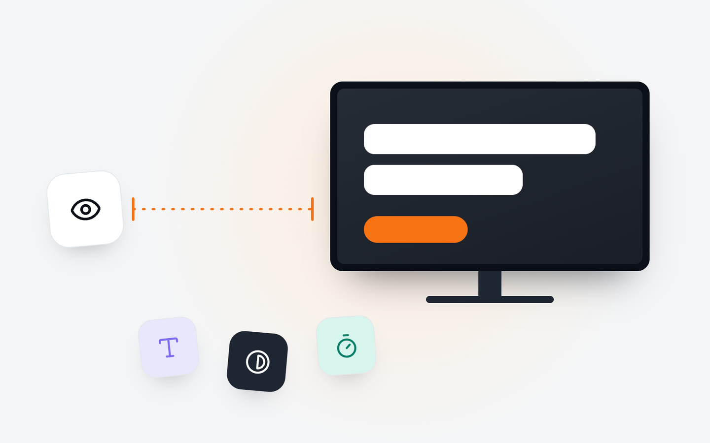
A screen gets a glance, not a read
Nobody walks into a shop to read its screens. They glance, and if the glance pays off they look a little longer. Everything on a screen should be designed for that first glance: one thing to notice, readable at once, from where people actually are.
That means the usual habits of print and web don't carry over. A poster can hold a paragraph because people can walk up to it. A website can hold a page because people scroll at their own pace. A screen on a wall decides the pace for them, from a distance, among everything else competing for their eyes.
How long do people look? It depends on where they are
The time someone spends in front of a screen is the most useful number you can know about it, and you can find it out yourself by watching for a few minutes. It varies a lot by place:
- Shop windows and entrances: people are walking. You get a moment, so show one message and one image.
- Queues and counters: people stand still for a short while and are already thinking about what to buy. A short loop that someone sees in full while they wait works well.
- Waiting rooms and lobbies: people sit for minutes. A longer loop is fine, as long as nothing repeats so often that it becomes wallpaper.
- Corridors and lifts: a second or two in passing. Directions, a time, a single notice.
Use what you see to set the length of the loop and of each slide. If people stand for about a minute, everything important should come round within that minute.
One message per slide
The most common mistake is putting too much on one slide: a headline, a paragraph, three prices, a logo, a website address and a QR code. Each is reasonable on its own. Together, nothing stands out and the slide is gone before anyone finds what matters.
- Decide the one thing you want people to take away, and make that the biggest thing on the slide.
- Keep supporting text to a short line. If you need more, split it across two slides.
- Leave a logo small and in a corner. People already know where they are.
- Add a QR code only where people can actually get close enough to scan it, such as a counter or a waiting room, not a window across the street.
Text size for the distance
Text that looks big on your laptop can be unreadable from across a room. The only reliable test is the real one: put the slide on the actual screen and read it from where people stand or sit, including the farthest seat and the back of the queue.
A practical habit that helps: design at the screen's real size and orientation, never in a small preview, and set a smallest text size that you never go below. Prices, times and directions deserve more size than you think. If something doesn't fit at that size, there's too much on the slide.
Contrast: the part that's easy to get wrong
Contrast is how clearly text stands apart from what's behind it. On a screen it matters even more than on paper, because of reflections, daylight and viewing angles. Light grey on white or brand colours on top of a busy photo look fine on a designer's monitor and disappear on the wall.
The W3C's Web Content Accessibility Guidelines (WCAG 2.2) set a contrast ratio of at least 4.5:1 for normal text and 3:1 for large text. They were written for the web, but they're a sound starting point for screens too, and free contrast checkers will measure any pair of colours for you.
- Put text on a plain area or a solid band, not straight onto a photo.
- If text must sit on a photo, darken or blur the area behind it.
- Don't rely on colour alone to carry meaning, such as red for a sale price. Add a word or a symbol.
- Check the screen at the brightest time of day, when glare is at its worst.
Fonts and motion
Choose plain, sturdy fonts with clear letter shapes, and save decorative ones for a word or two. Thin weights look elegant up close and fade away at a distance; regular to bold weights hold up. Keep to one or two typefaces across all your screens so they look like they belong together.
Motion catches the eye, which is exactly why it should be used sparingly. A gentle transition between slides or a short video in one area works. Text that flies in, spins or blinks makes people wait for it to settle before they can read it, and in a calm place like a clinic it can feel restless. A scrolling ticker is fine for short news or notices, as long as it moves slowly enough to read.
Keep it fresh, or it turns into wallpaper
Even good content stops being seen once people have seen it many times. Regulars, staff and people who wait in the same room every week will stop looking at a loop that never changes.
- Change offers and messages every few weeks.
- Let content follow the time of day, so morning and evening visitors see what's relevant to them.
- Add something live: the time, the weather, the next departure, a countdown to an event. Live information gives people a reason to look again.
In Jonza, live widgets such as a clock, weather, news, a countdown or opening hours sit on top of your content and keep themselves up to date, so the screen stays current without anyone editing it.
In short
Design for the glance: one message per slide, large text, strong contrast and calm motion. Find out how long people really look, and let that set the length of your loop. Then do the only test that counts: stand where your customers stand and read the screen as they would. If you hesitate, they'll walk past.
If you'd like a hand, our team can set up your screens remotely and help you build a first set of content that's easy to read from day one.